LinkedIn has decided that it is time to update their client experience when it comes to Company Pages. While this update isn’t live just yet, the beta version is fully available to page administrators. LinkedIn recommends you prepare for this change sooner rather than later as it will totally change the look and feel of your LinkedIn Company Page.
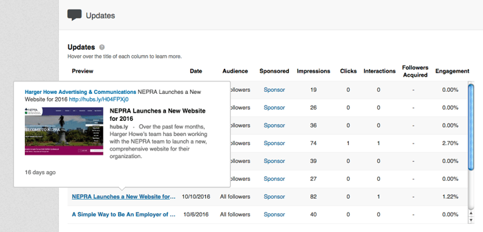
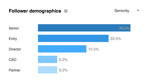
So what changes will be happening? Well, first of all the look is going to change drastically, but more importantly they are adding more insights into the pages via an expanded analytics dashboard. Here are some screenshots of the updated analytics dashboard of Harger Howe Advertising to give you an idea of the benefits:

 As you can see, the analytics dashboard will give you information on exactly who is following you and which of your updates are garnering the most attention. This sort of information will make it much easier to deduce patterns and set obtainable, actionable goals with regards to clicks, conversions and overall impressions. And, in addition to more insights, administrators will now be able to do in-line editing. For those who don’t know, in-line editing is, “a new technology that allows you to select any editable element on the page and edit it in-place. As a result, the editor can be used to edit content that looks just like the final page.”
So what do you need to do while this switch is in its beta format? There are two significant changes that need to be executed:
1. Resize Your Cover Image
Your current cover image is probably set to 646 pixels by 220 pixels, so it will definitely need to be changed as LinkedIn is now offering you more real estate. Linkedin’s Product Manager, Sparsh Agarwal states,“the recommended size for the cover image is 1536 by 768 pixels.
2. Resize Your Logo
The minimum size logo of 300 pixels by 300 pixels isn’t exactly new, but some companies have forgotten to update them. As a result, some companies have white padding around a smaller logo and that definitely does not make the best possible visual statement. LinkedIn’s Product Manager, Sparsh Agarwal suggests, “update your company logo and add a tagline for your company. The minimum logo size is 300 by 300 pixels.”
The overall look and structure of LinkedIn Company Pages will be different from here on out, but by making these changes, you will be ahead of the curve when Linkedin formally rolls out the official update.
--
Do you want to read more articles like this? Subscribe!


