It's tempting to just pick a few photos that you like and then totally forget about your company's Facebook page. But is that really the way to go? Facebook trends are changing faster than you can imagine and it's easy to fall behind if you're not careful. We break it down to four easy ways you can make your company page more attractive to your customers.
1. Update your cover photo.
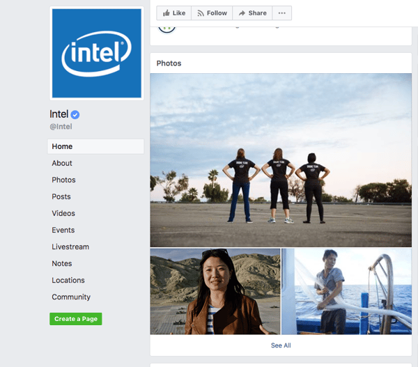
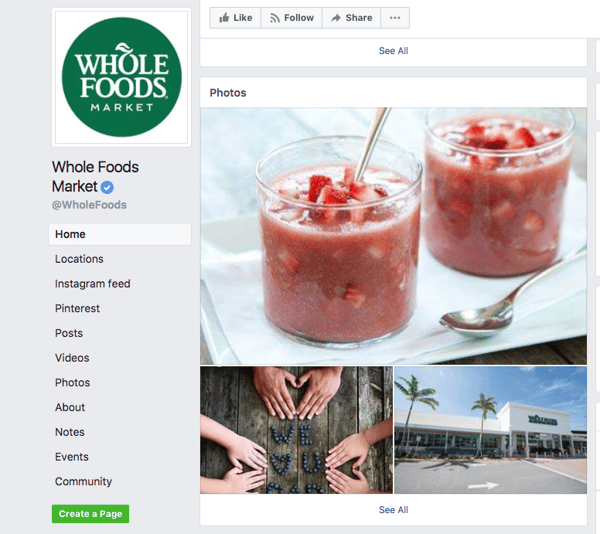
We don't know if you've noticed, but your cover photo is actually more important than your profile picture. Say what? It's true! Since Facebook has made significant changes to their page layout, the profile picture, which used to be the thing, has now been downsized to a much smaller position on your page. The horizontal cover photo is now the single largest image on your page, so it's now become the most important. Check out some of these profiles of famous companies to see what I mean:


As you can see, the profile picture has become way less important than it used to be; companies mainly just use it for their logos. The cover photo is where the marketing is. Our advice is to find or create some really stunningly beautiful images that showcase what you do and use those. And don't forget to change them too! You should never go more than a quarter, for example, without putting up a new photo.
Another even more cutting edge option is a video cover photo. Check out University of Phoenix's Facebook page, and Harvard University's. These videos use all the same techniques as a regular cover photo - beautiful images which showcase what the company does best - but makes their message exponentially stronger through use of video. Producing a video like this for your company may be more costly, but if you're looking to increase your Facebook following and clientele, it's an investment that will seriously pay off.
2. Rewrite your “About” section.
Since it isn’t visible on the main view of your page, many companies forget that it’s there and don't spend much time on it. Don’t make that mistake! Even thought it isn’t visible on the preview, this is actually a page that many visitors will navigate to. I can’t tell you how many times I personally have been interested in a particular business with a beautiful Facebook presence, navigated to their about page, and was totally dismayed by either no information or a giant wall of chunky text.
Facebook doesn’t allow too many options for customization in this section so you can’t use bold or italics or underlining, but that's okay. Go for short and sweet - try to come up with one sentence that really reflects your business. If you do need to put more information, use a lot of line breaks to add space and definition to your writing and make it easier on your reader’s eyes. Here are some examples:
 Very pithy, and pretty cool sounding, right?

This one is longer, but is easy to read. The paragraph break helps with that. They quickly outline their business and offer a quick link to their website where the reader can find more information if they want it. Easy to read, easy to understand - perfect!
 Lyft's "About" description is also short and sweet. It makes it immediately clear what their product is and how to use it. They also provide a helpful link where the reader can find more information if they want to.
What does your company's "About" page look like? Chances are it doesn't quite look this nice. This is your chance to get ahead of the competition - take it!
3. Add videos to your wall.
As we all know, Intel is a huge company and has plenty of money to put into making a cool video. Does that mean that smaller companies should stay away? Of course not! While a well-produced video is certainly something every company should definitely be putting into their budget, even basic videos, shot from a phone with zero editing still have major currency on Facebook.


Scroll down your page and see what photos are appearing in your “Photos” section. Are these the photos that you want representing your business? If they’re not, change them!
Overall, make sure you’re paying regularly looking over your company Facebook page and constantly updating your visuals and text! Facebook pages are now almost as important (if not more important) than your company website, so make sure you are investing time in making yours look as beautiful and compelling as you can.
Want more tips on how to most effectively use your company's social media? How about the latest information on marketing? Click below to subscribe to our blog! You can also follow us on Facebook, Twitter, Instagram, and Pinterest.


